KODH REDESIGN
In this case study I will be discussing my logic and process for improving the UX and visuals of KO Designhouse's website to increase it's conversion rate.
Role: Web Design + UX/UI + Copywriting
Tools Used: Figma, Shopify
Project Duration: 2 months
Background
KO Designhouse (KODH) is an Australian brand specialising in premium camper van furniture. The company's digital platform does not adequately reflect its industry-leading status due to several underlying web design issues.
Problems:
1. Template Limitations: The reliance on a free Shopify template has resulted in a website that lacks robust user experience (UX) and brand consistency.
2. Navigation: The site’s navigation is not taught through, making it difficult for users to find what they need efficiently. No breadcrumbs.
3. Copywriting: AI-generated copywriting fails to effectively communicate the brand’s premium identity and can be unclear.
4. Calls to Action: CTA buttons are not prominently displayed.
5. Brand Perception: The overall aesthetic and functionality convey a lower-tier quality that does not reflect the premium nature of the brand or its products.
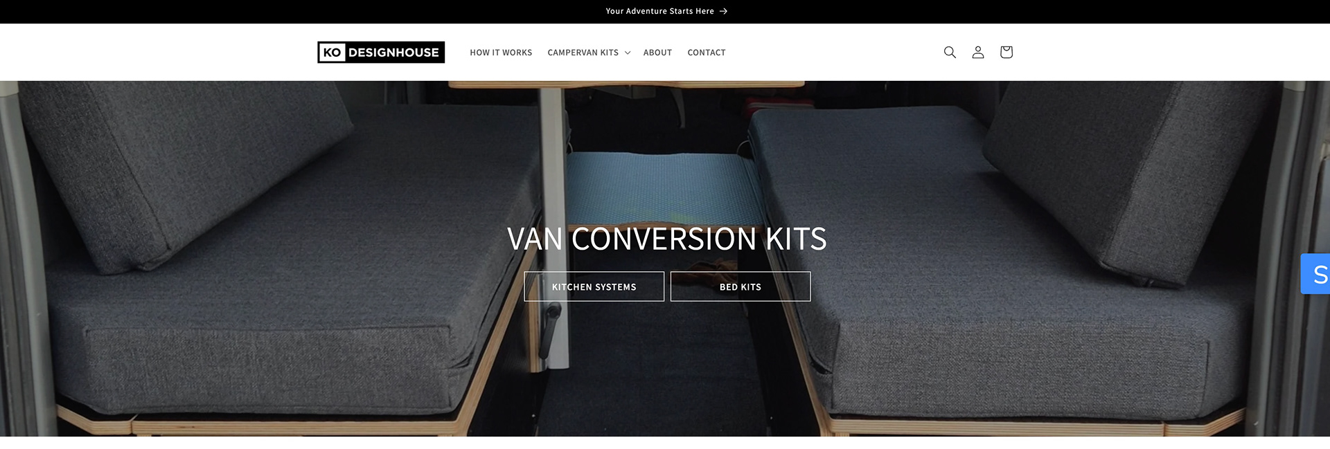
The old hero section
Performance Metrics Before Redesign
To fully understand the challenges facing KODH's website, I analyzed its performance metrics over 365 days. That included session numbers, orders, and the average monthly conversion rate. KODH's conversion rate has been around 0.09% which is much below the average rate for Shopify's stores (1.4%). This discrepancy highlights a pressing need for a redesign to enhance user engagement and improve sales conversions.
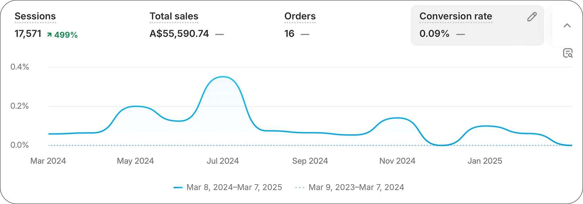
KODH website's metrics in the last 365 days
Redesign Objectives
After digging deep into the performance metrics, I crafted a set of redesign objectives to unlock the full potential of KO Designhouse's website:
1. Enhance UX: Streamline navigation and create a more intuitive and responsive experience across all devices.
2. Increase Conversion Rates: Optimize the checkout process and enhance the visibility and appeal of CTAs to convert more visits into sales.
3. Strengthen Brand Identity: Revise the visual elements such as colors, typography, and imagery to reflect the premium quality of the brand.
3. Improve Copywriting: Optimize the content so it sounds more professional and is tailored to the target market (Australians).
4. Boost Mobile Usability: With a significant portion of traffic coming from mobile devices, enhancing mobile usability is crucial.
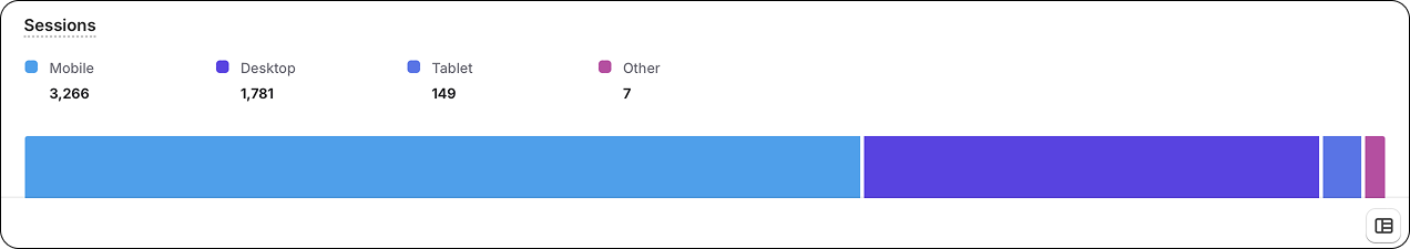
Sessions by device type in the last 90 days
Design Process
1. User Persona: Jack
To ensure my redesign objectives directly address real user needs, I developed a detailed user persona. While formal user research wasn't feasible due to time constraints, I utilized discussions from relevant topics on platforms like Reddit and Instagram, combined with characteristics of individuals I know personally. This approach allowed me to quickly synthesize a realistic persona that reflects potential users’ needs and behaviors.
Jack represents KODH's core customer base—adventurous, tech-savvy individual looking for high-quality van conversion solutions.
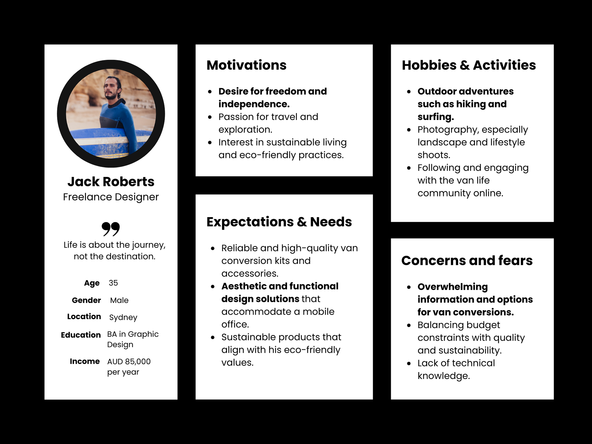
Leveraging Jack's persona, I simplified the site's navigation, enriched the copywriting and visuals to highlight freedom and travel, directly appealing to users like Jack who value adventure and ease of use.
2. User Flow: Jack purchasing a high-quality van conversion kit
I then developed a user flow to illustrate Jack's path through the website, from initial interest to final purchase. To cater to users like Jack, who may be overwhelmed by choices or need straightforward solutions, the redesigned user flow offers clear pathways. These pathways help users efficiently find products or get additional support as needed.
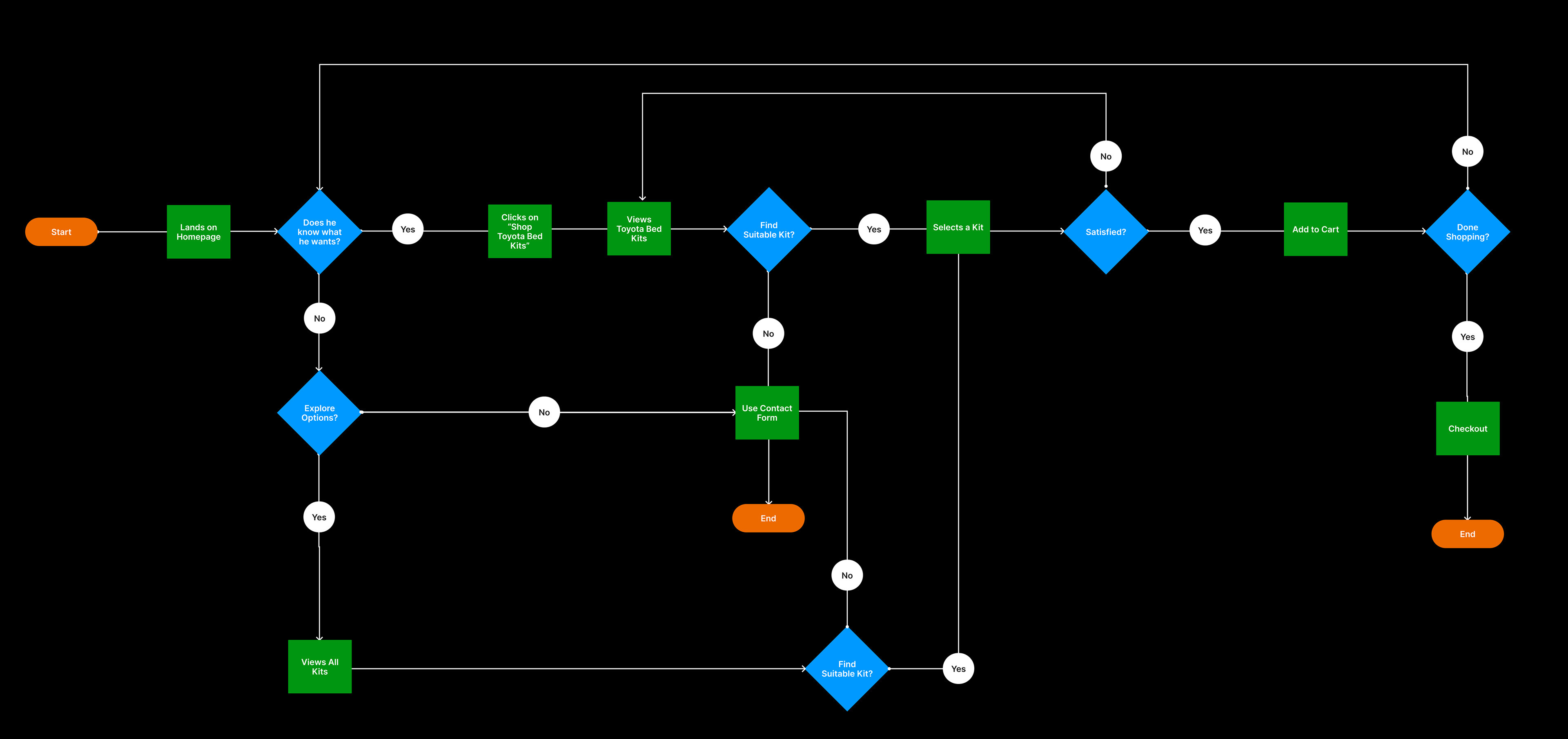
Click to zoom
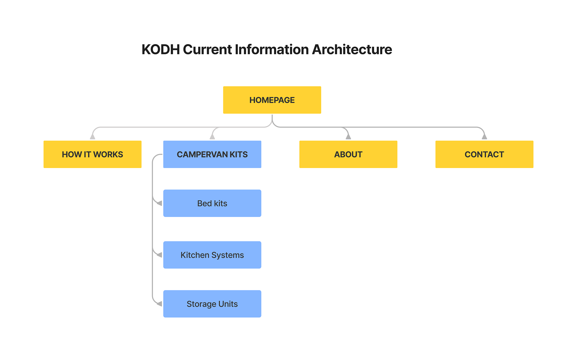
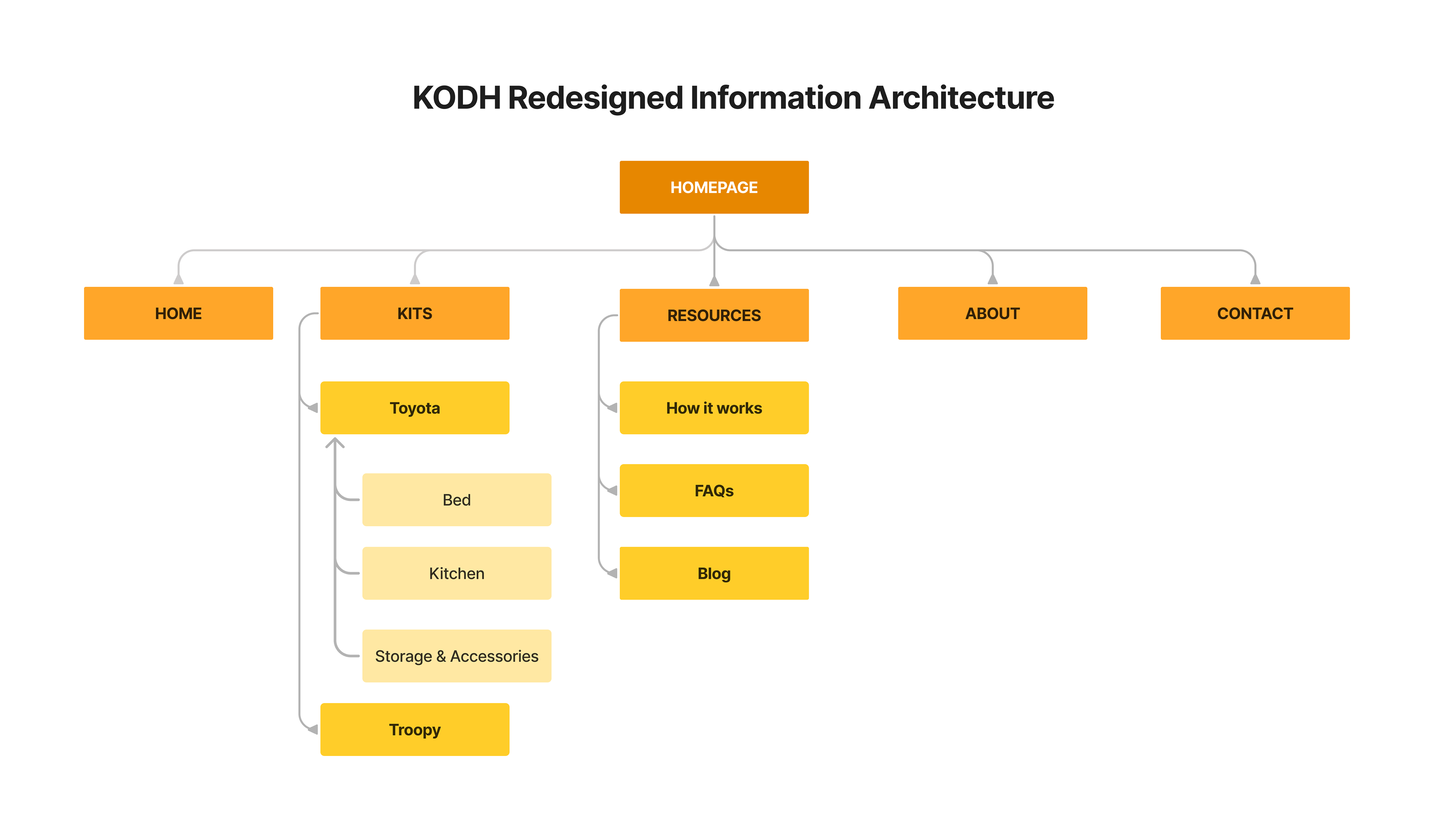
3. Improving The Navigation
Next, I enhanced the navigation by adding a 'Troopy Kits' section as requested by the client and introduced a blog to improve SEO and increase traffic. Additionally, I reorganized the "Resources" section to include a blog, FAQs, and 'How It Works' pages, streamlining access to information and supporting users in their decision-making process.
Click to zoom
Click to zoom
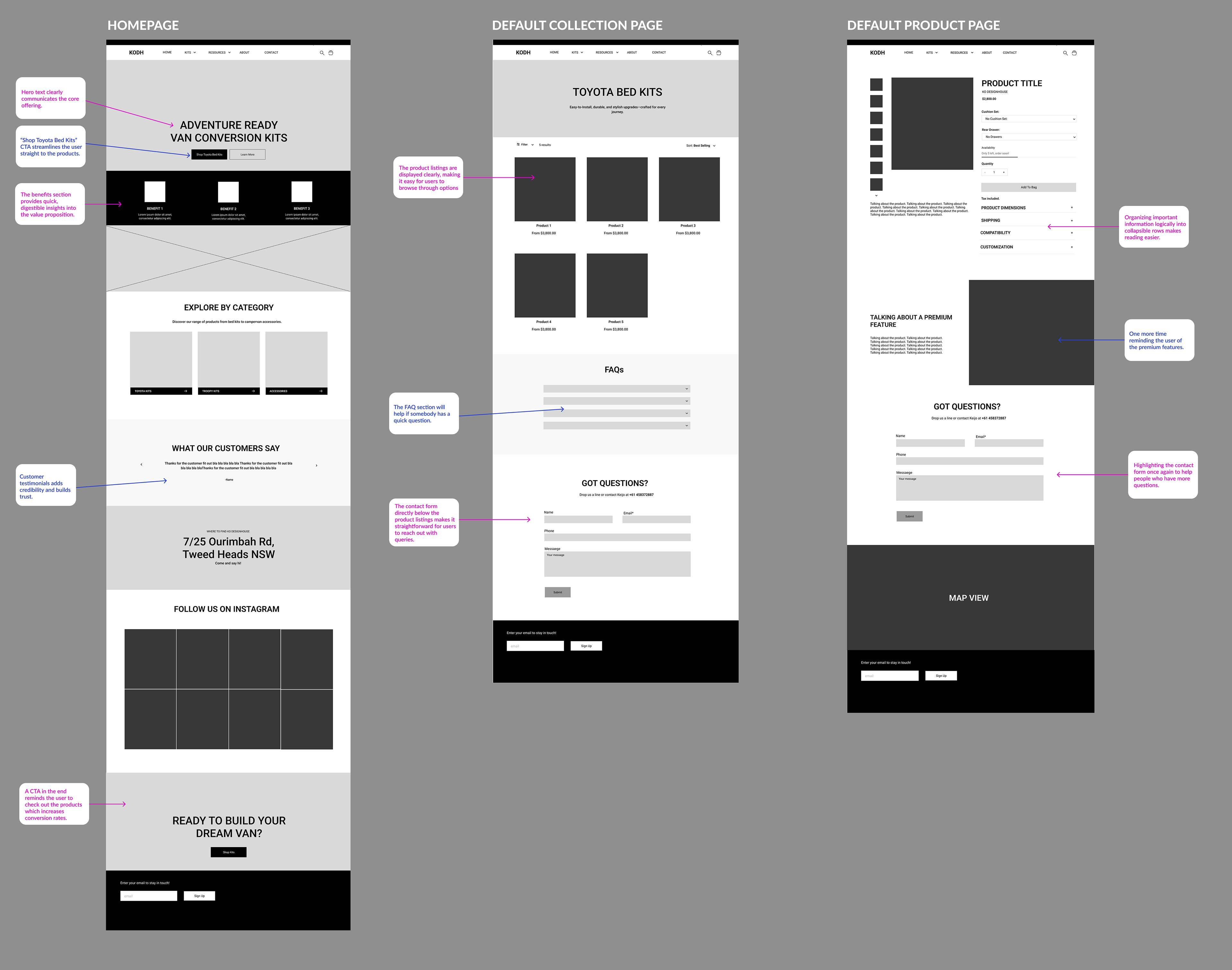
4. Wireframes
I focused on redesigning the three most crucial pages: 'Homepage,' 'Toyota Bed Kits,' and 'Product Page.' These wireframes were developed with the constraints of Shopify's Stiletto theme in mind.
Click to zoom
5. Style Guide and Components
KODH didn't have a branding guide which reflected on the website's inconsistent style. I decided to use Archivo Bold for bigger and smaller headings, DM Sans (regular) for body text. For color I went with white - as the client suggested - and #14141B which is almost black.
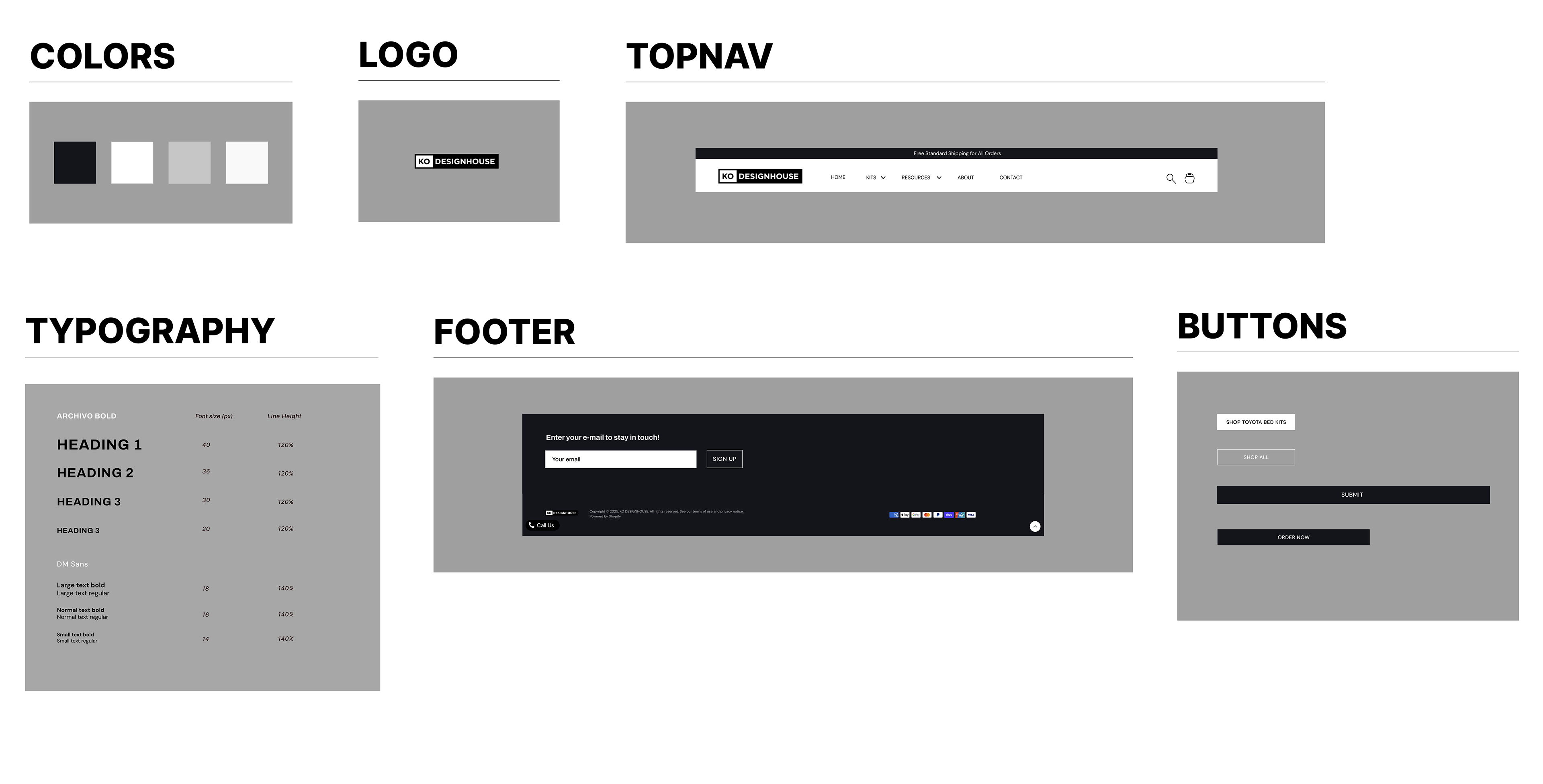
Click to zoom
✨Final Redesigns and Comparison✨
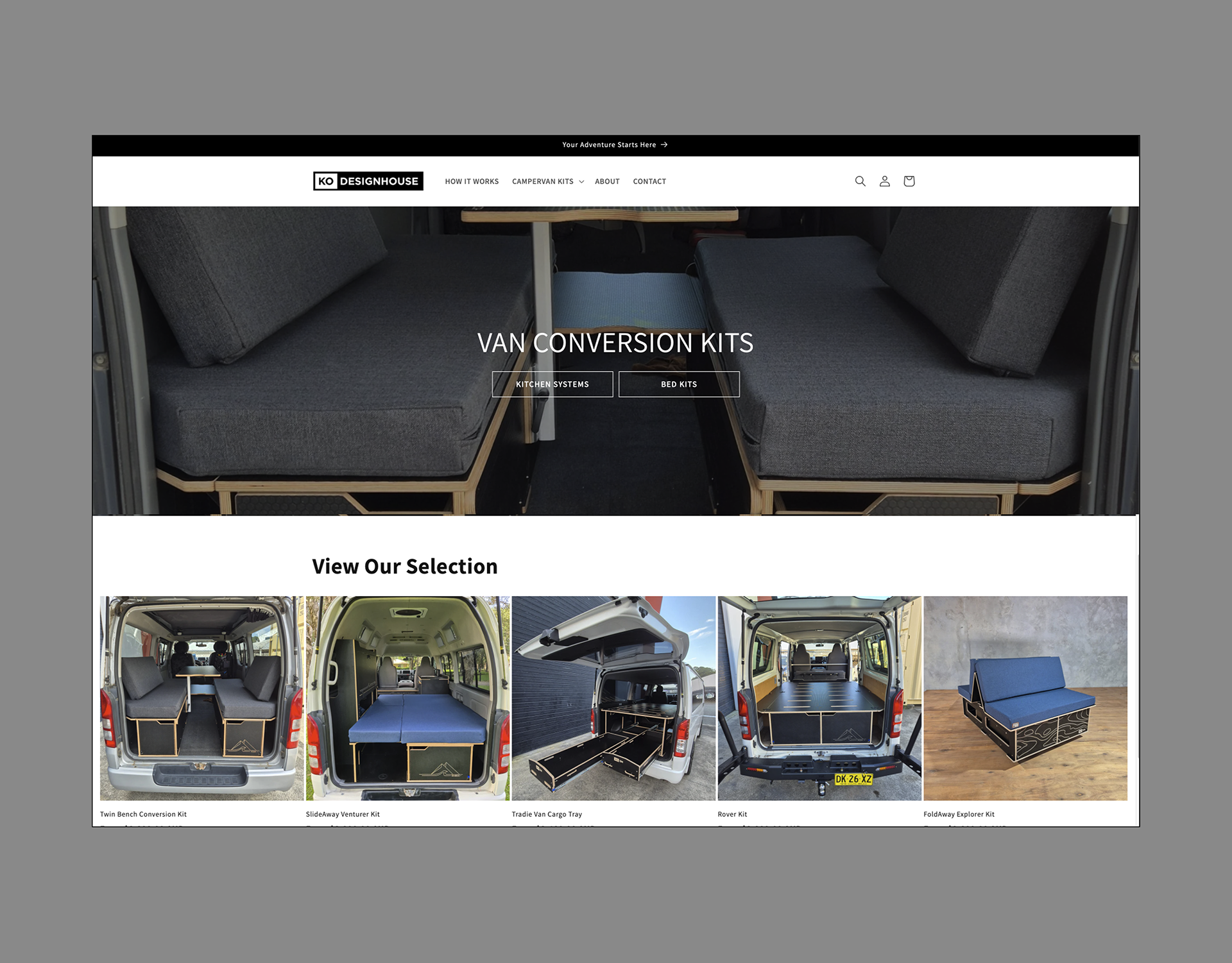
Hero Section
In the original hero section, the CTA buttons for "Kitchen Systems" and "Bed Kits" were not very noticeable, despite "Bed Kits" being KODH's best-selling product. The hero image was also too plain, not showcasing what makes KODH kits special.
I revamped this by introducing a new hero image with a smiling person in a van, invoking a sense of adventure and freedom. With 80% of KODH's orders being for bed kits, I streamlined the navigation by focusing the main CTA on "SHOP TOYOTA BED KITS." I also made this button more prominent in the design to grab attention quickly.
Before
After
Click to zoom
Click to zoom
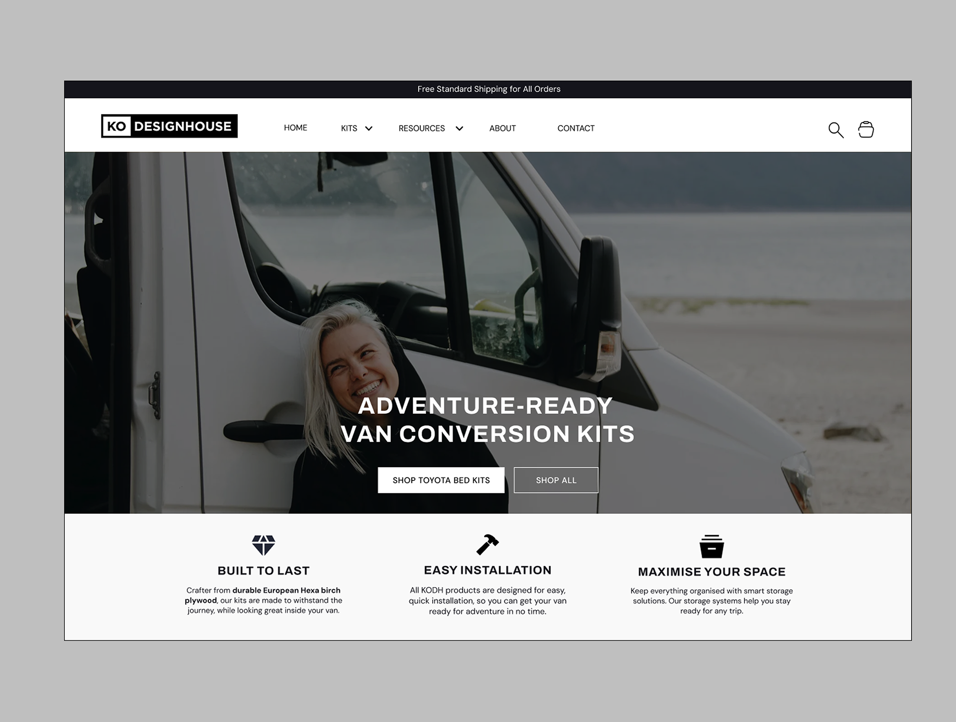
Products and Testimonials Section
In the previous design, the layout suffered from inconsistent padding and typography, which made navigating the product offerings overwhelming. To address this, I reorganized all products into distinct categories, making it easier for customers to find exactly what they need. This categorization not only simplifies navigation but also helps in showcasing a wider variety of products at a glance, enhancing user engagement.
I then standardized the typography across the site to create a cohesive visual experience and infused testimonials with a touch of the new branding. These changes not only enhanced the overall aesthetics but also imparted a premium feel, elevating the perceived value of KODH's products.
Before
After

Click to zoom
Click to zoom
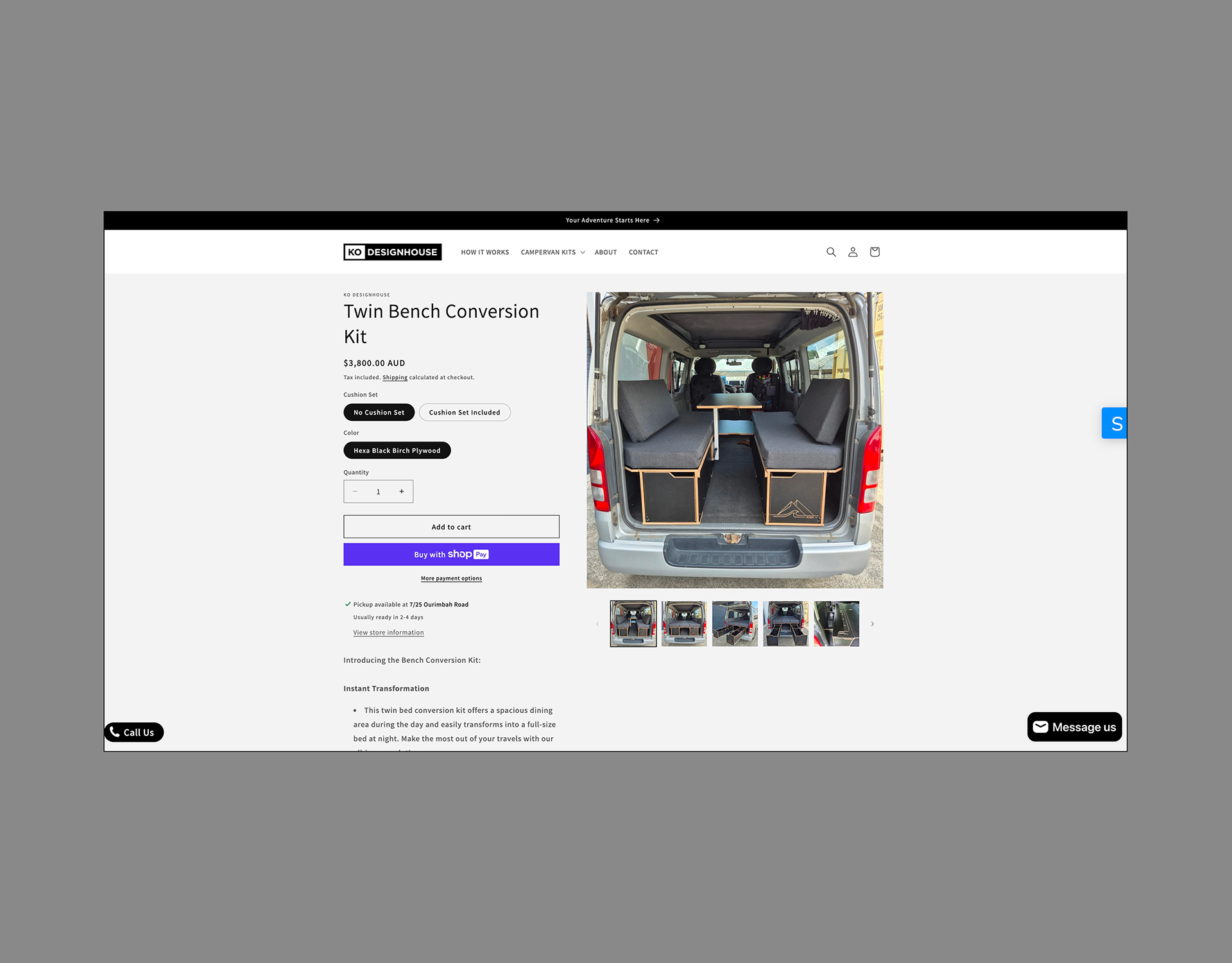
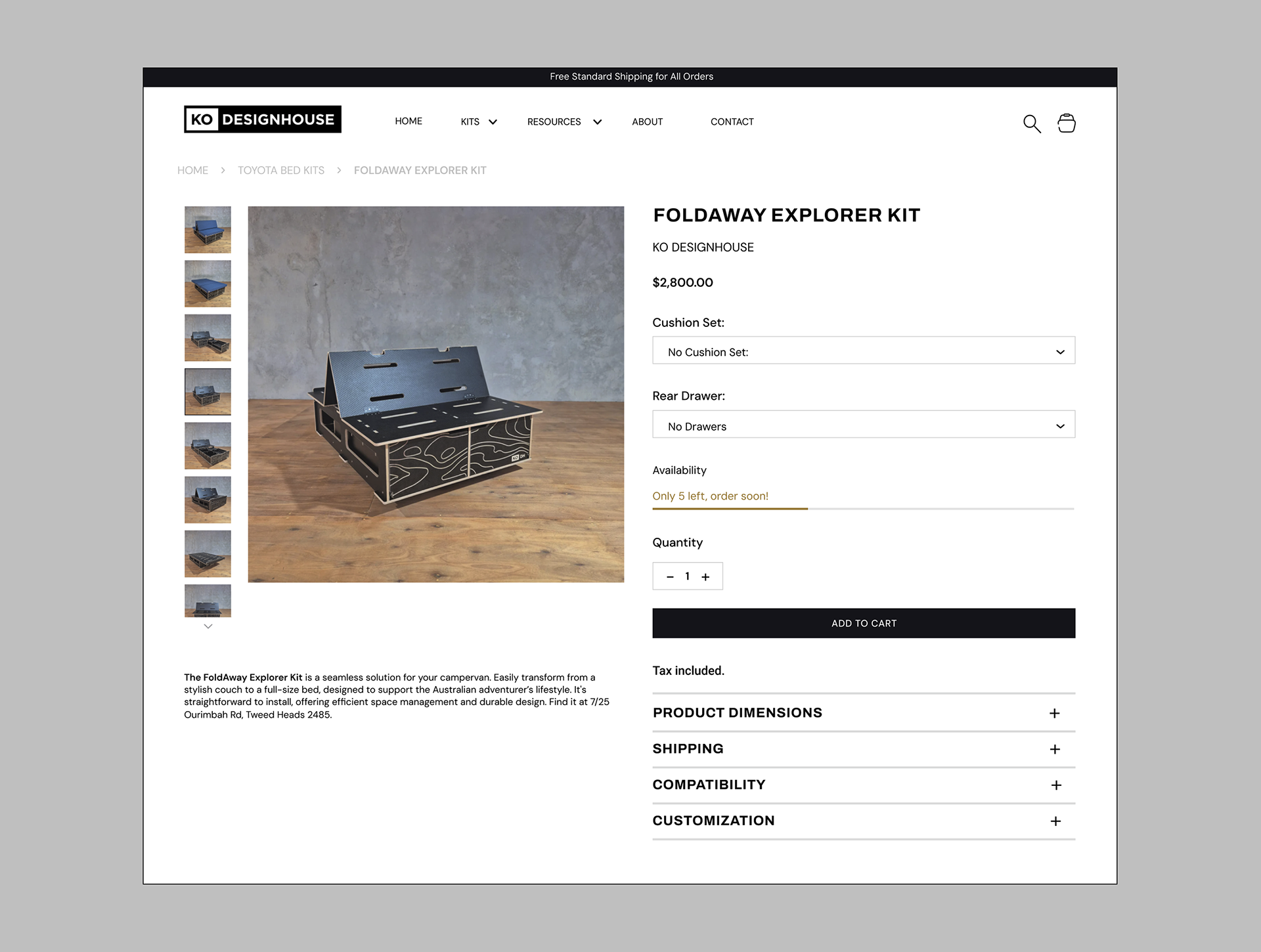
Product Details Page
The previous product page layout was cluttered and lacked cohesive branding, making it difficult for customers to find and process information efficiently. The content was unorganized, with critical details like product specifications, pricing, and availability scattered across the page. Notably, the absence of breadcrumbs further hindered navigation.
In redesigning the product page, I introduced a structured layout that categorizes information clearly and logically. Key product details, such as dimensions, shipping information, and customization options, are now presented in dedicated sections, enhancing readability and user flow. I also implemented breadcrumbs at the top of the page, improving site navigation and enabling customers to understand their location within the site hierarchy at a glance.
Before
After
Click to zoom
Click to zoom
The new design is expected to improve user engagement and conversion rates by streamlining navigation and making product details more accessible. Future iterations will expand on mobile usability to further optimize the experience.
Resources


